The site I have decided to improve is http://www.currypotdining.com/ This site is for a local Indian restaurant and the site is terrible. When you first open it you are bombarded with flashy images and as a result do not know where to look. There is also indian music playing which just feels tacked on. I definitely feel that I can improve this site a lot.
For the 3 resolutions I plan to design for the Samsung galaxy s3mini's 1280x720, my desktops 1920x1080 and my laptops 1366x768. These are all very common resolutions and cover both mobile and pc. The OS would be android 4.1.2 and windows respectively and the browser would be google chrome for all three.
Zac's Design Gallery
Thursday, 6 March 2014
Tuesday, 18 June 2013
Finished Animations
I have now finished my animations and they are ready to be put in game. Here are the links to the playblasts of these.
Monday, 10 June 2013
Adding pole vectors to rig
After animating a walk cycle for the creature a being immensely frustrated for hours by the fingers spinning around in crazy directions, I have found out about pole vectors and how they let me control the spin angle on the ik handles. Now I can animate much quicker and achieve much more natural looking movements.
Wednesday, 5 June 2013
Creature fully rigged and ready to be animated
Below are all the various stages of the rigging process for our games creature.
This is the model with the skeleton complete. I haven't worked on a humanoid
shape before so I look forward to the outcome.
For the weight painting I used a dual quaternion weight blend to get the best of both
linear and weight blended so that the joints would bend in a realistic way and not
stretch the skin in ridiculous ways.
I have now added ik joints and parented these to circles that I will use as my
animation controllers. These are working well as the movements are looking
quite natural.
Saturday, 1 June 2013
New Creature low poly model
Jordan has finished the low poly model for the creature that will be hunting on our island. Now I can start rigging it up to be animated. Will hopefully get this done quickly as I am looking forward to animating it.
Below is the high poly version of what I will be rigging.
Below is the high poly version of what I will be rigging.
Tuesday, 28 May 2013
Work on the island visuals
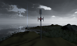
So I have been chipping away at this island trying to get it looking the right way for our night time game. While Jordan is still busy building assets for the island I am working on getting the water and fog to look right. I managed to find that Unity pro has some really nice water hidden away in its assets so have applied that and it instantly looks better. It is actually transparent now and receives light from other sources unlike the old water. It also has small swells which is really cool and natural looking. For the fog I have been playing around with volumetric fog which looks great from some angles but looks absolutely horrible from others so I'm either going to have to find a way to tweak this or find another solution all together. I am considering trying out the cloud system for this.
Tuesday, 30 April 2013
Filling out the island with unity's standard assets
I used the basic assets that come with unity to fill out the island a bit so we could get a better sense of how it will look when it is done. These are just place holders at the moment but they look a lot nicer than an empty valley.
Subscribe to:
Comments (Atom)


